Mobile App Design
Project Time: 3 weeks


The Back Story
This was one of the most enjoyable projects I’ve worked on! I was fortunate enough to work on a team with some very talented, spirited, diligent and kind-hearted individuals. Needless to say, apart from all the hard work we put into designing this mobile app, we had a fantastic time doing it!
My team and I felt that we had put our heads together to design something truly meaningful that could impact many lives in a positive way.

The Task
I worked with four other user experience designers for the entire project. We were tasked with designing a mobile app to solve a common problem that people encounter in their day-to-day lives. It was left to us to explore what that problem was – so essentially, we had a blank slate to work with.
We unanimously agreed to work on a mobile app that would help users seamlessly source nonprofits to donate their gently used or new items to and be able to arrange a convenient way to get it to them.

Setting the Stage
Many of us have clothes we don’t wear anymore, or in the middle of moving house and need to declutter, or perhaps we’re parents whose kids have outgrown their clothes and toys… where do we put it all?
By donating it, we’re doing two wonderful things:
1. Giving back to our communities by helping those in need, and
2. Being environmentally friendly by recycling our gently used items.
Here’s the thing: finding an easy way to donate items can be a challenge. At times, we’re not even sure some organizations will accept them. Not only that, but it can be time-consuming and a hassle trying to get our items to the right place.
We set out to explore possible solutions, but first, we needed to really understand our users and their pain points.
Proto Persona
Understanding our Users
In the Research Phase, we conducted qualitative (one-on-one user interviews) and quantitative research (Google survey) on the pain points of our users trying to donate their items. We developed a proto-persona to help us describe our target users and audience, based on assumptions.
User Interviews
The Insights
Our participants came from all walks of life, in various age groups (from 23-45 years of age) and in different life stages, but in particular, busy moms.
This is what we found:
Many users wanted to help their community and recycle their goods by donating them, but if it was too difficult to do, they’d prefer to either throw it away or keep it for longer.
They wanted to know which organizations would accept their donations.
They would love to have reputable nonprofit organizations pick their items up for free. Some were even willing to pay a small fee for having it picked up.
All users used their devices to find resources and to do most of their research.
They were willing to drop the items off themselves, but if it was too far or time-consuming to find a nearby location, they’d think twice about it.
Using a Miro Board to ideate
The “Eureka!” Moment
The ideate phase was the fun part! Using a Miro board, we brainstormed ideas for our app using the “I Like, I Wish, What If” method. Dot voting helped us refine our choices. We came across some pretty interesting thoughts, but we finally decided on 3 main features to push forward with. We plotted these as being high impact with low complexity on our Prioritization Matrix.
User Scenario
A Day in the Life of Our User
We also created a user scenario and storyboard, to help us empathize with our user while using the app.
The experience outlined the user’s initial tasks she was trying to accomplish and the challenges she had while doing so. Thereafter, how she would go about searching for a solution, then discovering and using the app and finally engaging in the app to solve her problem.
User Flow
Onward and Upward
At this point, we were ready to develop our user flow. Our group worked tirelessly to build a flow that was simple, yet intuitive to the needs of our users.
In regards to onboarding, our thinking was that we wanted users to draw value from the app by first experiencing the features. However, if they wanted to book a scheduled pick-up of their donation, they’d need to sign in.
Our team collaboratively designed the wireframes. We did this by having each member pick a certain feature of the app to work on. By working this way, it allowed flexibility for each of us to build out our frames separately and in our own time. We agreed on a preset template and adapted it according to our needs. We then brought our wireframes together, ironed out any differences and checked for inconsistencies.
Once we were happy with our wireframe, we proceeded to create a clickable prototype.
Usability Testing Results
Tried and Tested
When it was time to test our prototype, we developed a Usability Testing Plan, outlining 5 different tasks for users to complete. 80% of users were able to complete all 5 tasks successfully the first time.
All user feedback was recorded, transcripted and then documented on a Miro board. We assessed and prioritized based on the frequency of response.
Low-fidelity Wireframes
Getting it Right
It then became necessary to iterate on our user flow, wireframes and prototype.
Once completed, we went back to our users to re-test. We asked users who had previously tested the prototype, new users, as well as those who participated in our initial user research before developing the app itself. This gave us a more rounded perspective on whether users thought our app had improved from the first iteration, and if it essentially solved the problem they were having in the first place.
All users had a favourable response. They were able to understand the main features of the app, easily navigate it, find what they were looking for and onboard. Not only that, but all of them remarked that this app would be one they could see themselves using frequently.
We were now excited to start our mid fidelity prototype! We named our app “Kyndli”, and created a logo and colour theme, which set the tone for our new app.
The Features
A couple of major updates we made from our user’s feedback on the initial prototype were the animation of the splash screen to help users land on our homepage faster. More importantly, we incorporated symbols into our buttons to minimize the time selecting tasks by providing visual cues, as well as to familiarize the user with our key feature icons in the bottom navigation bar. These changes were able to help our users cut their time to perform tasks by up to 50%.
Feature 1:
Location and Organization Search
Users are able to search based on either their location or a specific organization. They are able to find all the information they need to drop items off themselves to their chosen organization, with the confidence of knowing where it is, when it’s open, what they accept and any useful tips to help them prepare their donations.

Feature 2:
Schedule a Donation Pick Up
If users are unable to drop items off themselves, they are able to specify their donation items on the app and quickly filter out organizations willing to accept them. From there, they can specify the location for pick up and have the option of choosing available dates that best suit their schedule. To confirm the pick-up, users sign into their KYNDLI account, a process made quick and easy.
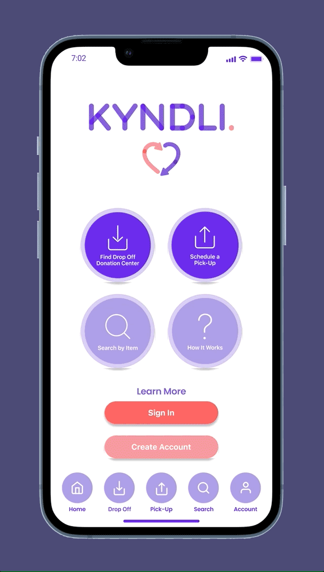
Feature 3:
Search by Item
If users are unsure of which organizations will accept their items, this feature would allow them to input their items to see who will accept them. They’ll do this by either taking a picture of their item/s (the AI technology reduces time searching for their item’s eligibility) or inputting the item into a text field, where a range of organizations would then be displayed for selection. The user can then choose to either schedule a pick-up through the app or drop the item/s off themselves.
The clean and minimal bottom navigation bar allows users to jump from task to task quickly and easily.
Future Opportunities and Next Steps
In the future, we’d like to develop Kyndli further, by implementing the following features:
Allowing users to favourite their organizations
Users being able to receive updates and/or stories of how their donations were used or repurposed
Create a marketplace-type interface, where users could post their gently-used items “for sale”, and prospective buyers, in place of payment, would instead donate to the “seller’s” chosen non-profit organization
Create a customized alert/reminder function within the app, asking the user if they’d have anything to donate within a 3, 6 or 12 month period.
Final Thoughts
Our group worked well together because we were able to leverage our individual strengths to work on tasks well suited to each one of us. We were also united in our goal to find a solution to a problem that was close to our hearts: that being helping the community and the environment.
But what made this project so enjoyable to work on, was the fact that not only did we empathize with our users, but with each other as a group and a team. We encouraged and supported each other and did whatever it took to make it work. Together.
