UX/UI Design Case Studies
Yellow Brick House
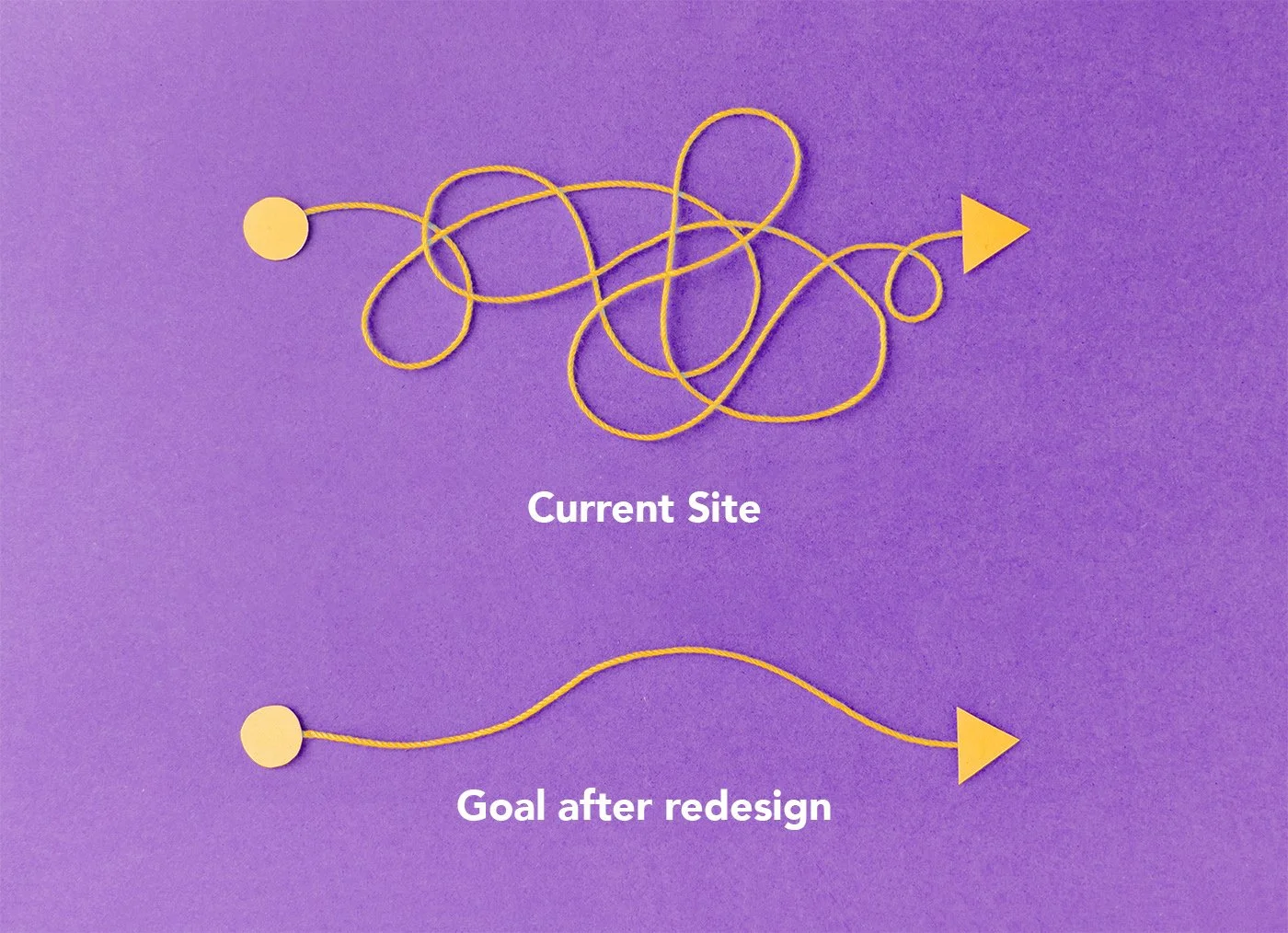
Establishing credibility and creating a safe space for victims and donors
Responsive Website Redesign
Project Time: 3 weeks

The Back Story
Yellow Brick House (YBH) is a local nonprofit based in Richmond Hill, Ontario, Canada. They offer support, shelter and counselling to victims of domestic abuse.
According to the Canadian Women’s Foundation, The COVID-19 pandemic has led to spikes in domestic violence not just in Canada, but globally as well. Months of lockdowns and stay-at-home orders have left victims, many of whom were already facing violence from abusers, exposed to even more attacks.
It was a crucial time for nonprofits such as YBH to reach out to victims in a way that didn’t draw unwanted attention to the victims themselves, as well as to provide a platform for donors to show their support in various ways.
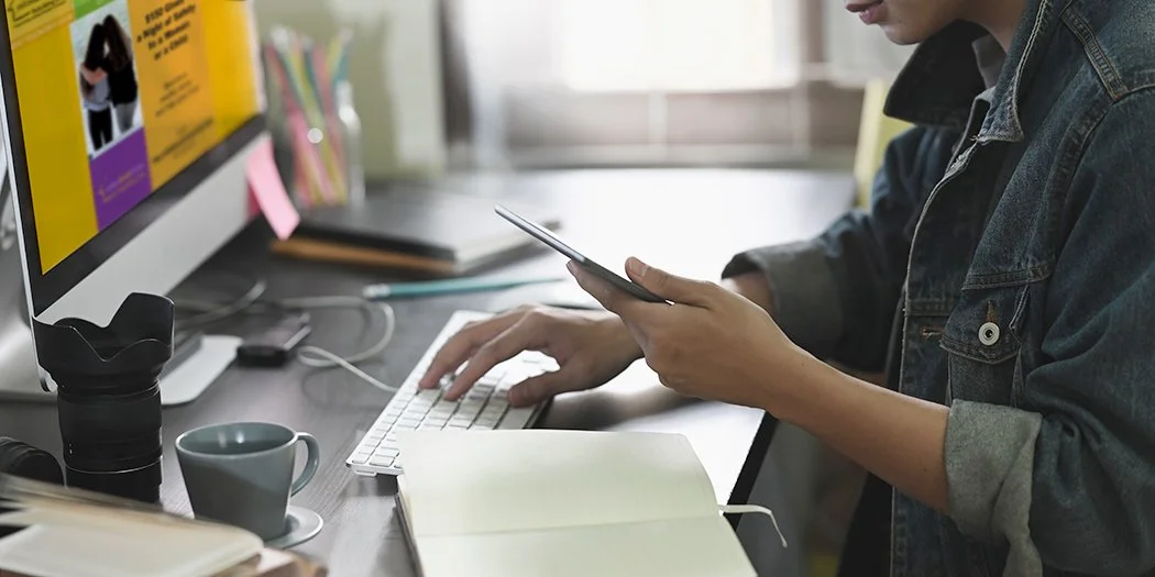
The Task
My team (comprising of two other user experience designers) and I were tasked with reviewing the YBH website to assess any usability issues and to provide recommendations for a better user experience.
We got to work right away on our process, which involved 5 phases: Research, Define, Ideate, Prototype and Test… iterate and re-iterate!

Research and Discovery
After exploring the site and documenting any observations, we conducted 2 phases of qualitative and quantitative research on the pain points of users. We had one-on-one user interviews and distributed a Google survey. Our users came from all walks of life, between 16 and 60 years of age.
Phase 1 was used to get a general understanding of how users felt about donating online to nonprofits and if they understood the cause. (One-on-one interviews were conducted with 3 participants and the Google survey was completed by 12 participants).
Phase 2 was more defined and detailed in nature, thanks to insights from Phase 1 (One-on-one interviews were conducted with 5 participants and the Google survey was completed by 27 participants).
Considering Our Users
We also developed 2 separate proto-personas to help us describe our target users and audience, based on assumptions. Our two proto-personas were the victim persona and the donor persona. Because of time constraints, we focussed on the donor persona, but it was important to consider the victim persona for our user path.
Victim Proto-persona
Donor Proto-persona
Our Findings
This is what we found:
67% of participants had never heard of YBH
100% of participants said they’d be happy to support the cause
An overwhelming 88% said that they would research this nonprofit either through google search, social media or the YBH website
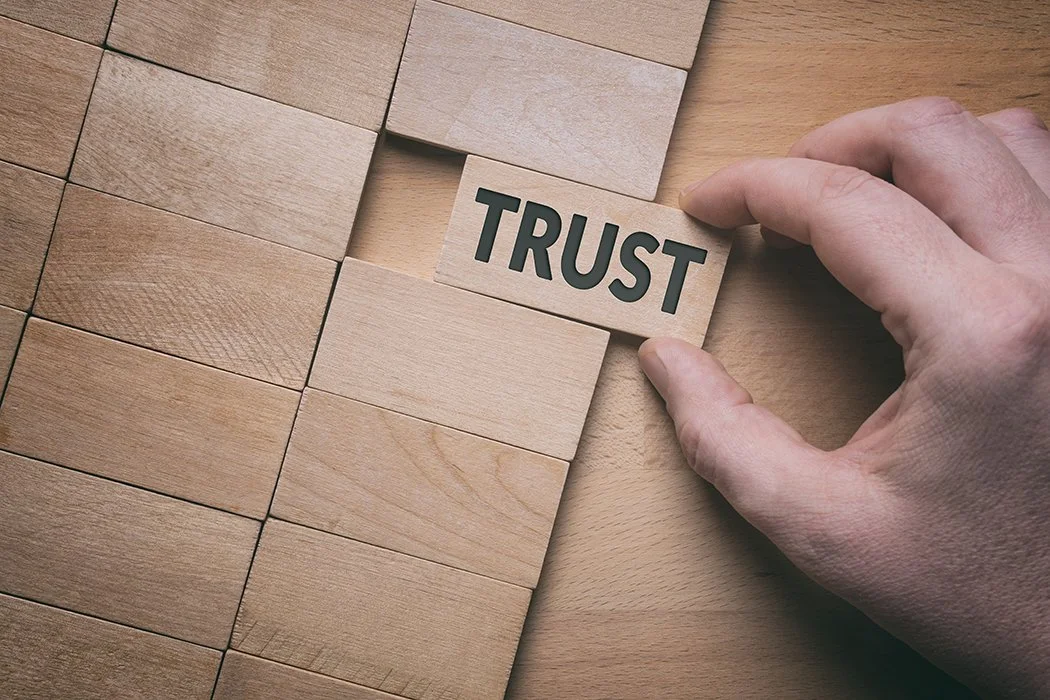
Before being willing to donate or help in some way, all participants said that nonprofits should show credibility and accountability. They also felt that transparency was important and keeping their donors updated on their impact in the community from time to time was key.
Defining the Problem
With this valuable insight, we proceeded to define and frame the problem. A user persona and the following problem statement were developed:
“The Yellow Brick House (YBH) website was designed to bring awareness to domestic violence issues and to provide easy ways for donors to show their support. We have observed that users don’t trust nonprofits because they don’t show enough credibility, which is preventing them from donating. How might we improve the user experience when visiting the YBH website so that donors are successful based on feeling good about donating to a worthy nonprofit with an important cause?”
Measuring Up
A Competitor and SWOT Analysis helped us assess the strengths and weaknesses of similar sites. A Heuristic Evaluation was conducted on the current site to see if it followed best practices.
One of Three Direct Competitor Analyses
One of Two Indirect Competitor Analyses
SWOT Analysis
Research Revelations
Our core findings at this stage revealed the following:
The YBH had an aesthetically weak front-facing website compared to other similar sites, optically not able to be perceived as a viable nonprofit.
Users found the site to be unengaging and although the menu served its purpose, more could be done to help users navigate the site more easily.
Their donation page looked unprofessional and there seemed to be a lack of cohesive branding on linked pages.
Users couldn’t quickly search the site to verify credibility, accountability or impact. This deterred them from wanting to donate or volunteer.
These findings were key when it came time to redesign the user interface. By addressing these concerns, we felt that the user experience could be drastically improved, thereby increasing engagement and donations.
YBH’s Gratitude Report and Brochure
Crucial Credibility
YBH is a credible and accountable nonprofit. Their printed materials, such as their Gratitude Report and brochure are well designed and include vital information such as who their board members are, their mission statement and vision, as well as where their funding comes from and how it’s being spent.
However, this crucial information wasn’t being communicated well on their website – there was a big disconnect. This was one of the main reasons why many users were hesitant to donate. If more than half of our users weren’t familiar with YBH, then we needed to ensure that when they landed on the website, the experience would be excellent, complete with engaging storytelling and visuals and that they’d feel compelled to donate!
UX Scenario
Ideating Possible Solutions
In the ideate phase, our Affinity Diagram and Empathy Map helped us isolate the pain points of users. A UX scenario helped us stay focused on the objectives and served as a guiding light when empathizing with our users.
Defining a Plan of Action
A user flow diagram showed us areas of improvement we needed to focus on. Ultimately, these areas were:
For victims, to show them how to go about getting help from YBH
Allowing users to easily see the services and programs that YBH offered
To show the user that YBH was credible, accountable and transparent
For users to quickly and easily make a donation on the website
We plotted these as being high impact, low complexity on our Feature Prioritization Matrix.
Previous User Flow
New User Flow
Old Sitemap
New Sitemap
Information Architecture
Our card sorting was one of the most valuable exercises in this project. We were surprised to see how relevant and crucial information was either hidden or non-existent, and less important information was more prevalent on their site. After re-organizing and structuring the cards, we finalized a sitemap.
Wireframes
Prototyping our Vision
We developed wireframes based on our user flow. I developed the initial wireframe and then worked with another designer to expand on those wireframes while incorporating feedback from our third team member. Once we were all happy with it, we proceeded to create a clickable prototype. Our moodboards were the inspiration for our UI Style Tile and Style Guide.
Prioritization Matrix
Test, Test, Test
When it came time to test our prototype, we developed a Usability Testing Plan, outlining 4 different tasks for users to complete.
These tasks were:
How would the user start getting help from YBH?
How would the user check the services and programs provided by YBH?
If the user wanted to check the legitimacy and credibility of YBH, how would they do that?
How could the user make a donation through the YBH website?
All user feedback was recorded and transcribed. We once again used a prioritization matrix to help us decide which iterations would be high impact and low complexity and updated our prototypes accordingly.
We then brought our low fidelity prototypes into high fidelity.
Back to the Drawing Board (Sort of…)
When we started exploring imagery for our homepage, we selected strong images we thought were impactful and would compel donors to help. After conducting some quick testing on what users thought of these visuals, we soon realized that the imagery could be seen as “scary” by potential victims and some donors may have had second thoughts about donating because of the dramatic visuals and the way they were portrayed!
We then had to take a step back and think about how to position the “flavour” and “tone” of the site. How could we make it look lighter and friendlier, but still engaging enough so that potential donors would be moved to help, and victims could feel safe and comfortable using the site to get help and access resources?
First design: Homepage with dramatic imagery and colour palette
Second design: Homepage with softened imagery and colour palette
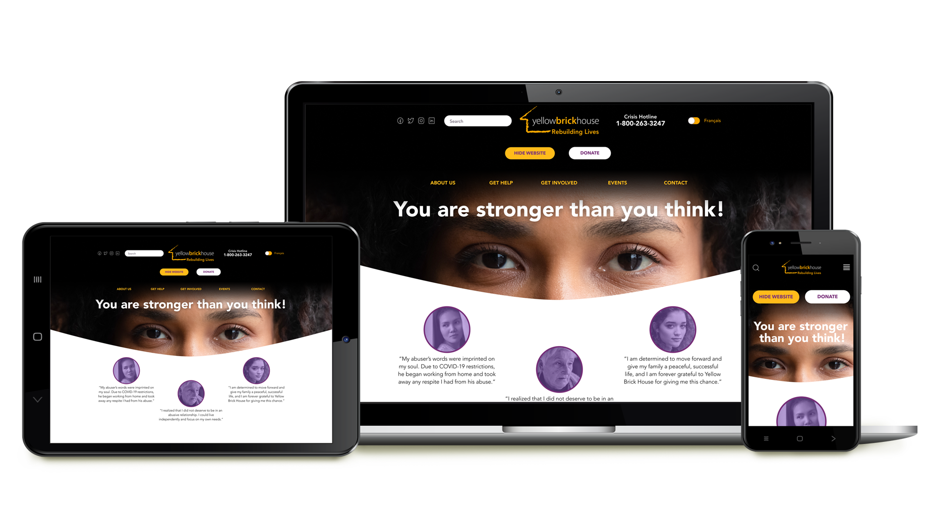
Final design: Homepage with updated imagery, similar tone but with a slightly stronger colour palette
Solving For Our Users

Problem:
The YBH has an aesthetically weak front-facing website compared to other similar sites, optically not able to be perceived as a viable nonprofit.
Solution:
We used an impactful statement and imagery to draw the audience in, using curved edges and symmetry to soften the overall look and tone. The use of white space directed our users to focus on key areas of importance, where the stronger purple and yellow brand colours drew attention to these areas. Also, because the deep homepage banner took up considerable real estate, we introduced a transition that minimized the banner once the user scrolled down.
Problem:
Users found the site to be unengaging and although the menu served its purpose, more could be done to help users navigate the site more easily.
Solution:
We used victim testimonials on the home page to create additional impact and to engage our users on an emotional level. The original site featured the hotline and “Hide Website” button in a prominent area of the home page and we chose to do the same for our site. The “Hide Website” button was an important feature of the site, as it allowed victims to be instantly directed to another unrelated site, in the event he/she felt threatened or were being watched by their abuser.

Problem:
The donation page looked unprofessional and there seemed to be a lack of cohesive branding on linked pages.
Solution:
We completely redesigned this page and gave it a more cohesive, professional tone. At the top of the page, we informed users of our privacy policy, with a link to review in further detail if they chose to do so. This would put users’ minds at ease knowing their information was private and secure and would then be more inclined to donate. We also drew attention to certain areas of the donation page, informing users how a monthly donation could provide maximum impact, by helping victims on a continuous basis.
Problem:
Users couldn’t quickly search the site to verify credibility, accountability or impact. This deterred them from wanting to donate or volunteer.
Solution:
When reconfiguring the information architecture, we were sure to make it easy for users to find this important criterion in the “About Us” menu. On the “Our Impact” page, we drew from YBH’s Gratitude Report to illustrate how funds were sourced and used within the organization. We also included buttons where users could download the full report and financial statements. The page would also show a running tally of hours and money spent counselling, helping and providing shelter to victims of abuse.
Measuring our Success
To gauge the success of our efforts, we compared the overall experience of users completing the tasks first on the old site, then on the redesigned one.
Our metric was the success rate and ease of use when completing tasks. The average success rate of completing tasks on the original site was 70%, whereas it was 100% on the new one.
However, when comparing how much easier it was to use and navigate, there was a noticeable difference. On a scale of 1 to 3, with 1 being the most difficult and 3 being the easiest, users found the new site much easier to navigate and were able to complete tasks considerably faster. Not only that, but they commented that it looked more professional, engaging and was more visually in line with their branding, thus improving credibility.
KPI’s Showing Success Rate of Tasks Performed
KPI’s Showing Ease of Use of Tasks Performed

Future Opportunities and Next Steps
In the future, we’d like to develop the website further, by implementing the following features:
Users being able to receive updates and/or stories of how their donations were used
Allow users to give feedback on their experience directly through the YBH website in real-time
Create an online store, so YBH could sell merchandise with empowering messages to increase awareness and generate funding
Partner with well-known brands to support the cause, like grocery stores to supply shelters with food and hygiene items, apparel stores for clothing and home renovation stores to outfit shelters with furniture and building supplies. These partnerships would be promoted on the YBH website to increase credibility, and on each respective retail site demonstrating corporate social responsibility. It’s good for business!
Final Thoughts
And finally...how did we successfully work together as a team? We used a Kanban board to keep us organized and to manage the workflow. We met via Zoom and communicated through Slack. We conducted stand-ups every other day.
We also researched and educated ourselves on various aspects of domestic violence issues, as it was important to be able to empathize with victims and donors alike. Through our research and conducting user testing, we were stunned to find that domestic abuse is more common than we thought! In fact, some of our test participants had either directly experienced or knew someone close who had such experiences. This fuelled us further and kept us motivated to help a valuable nonprofit improve their site so that they’d be able to gain more support, funding and traction to continue the important work they do.
At the time that this case study was conducted, we reached out to stakeholders at YBH. They showed interest in discussing the findings and reviewing the recommendations we had. Unfortunately, we were unable to connect after concluding our project. We will continue to reach out to them in the hopes that our recommendations will be used to expand awareness and support of their cause.
YBH was in the midst of redesigning its website and had completed the work by the time we had concluded our case study. This explains why the current YBH site looks different from the one we first assessed for this case study.
This project was enjoyable to work on because we engaged in meaningful work. We were able to make a difference in some small way… and that’s what makes it all worthwhile!
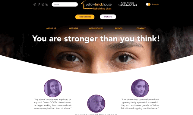
YBH website - BEFORE redesign
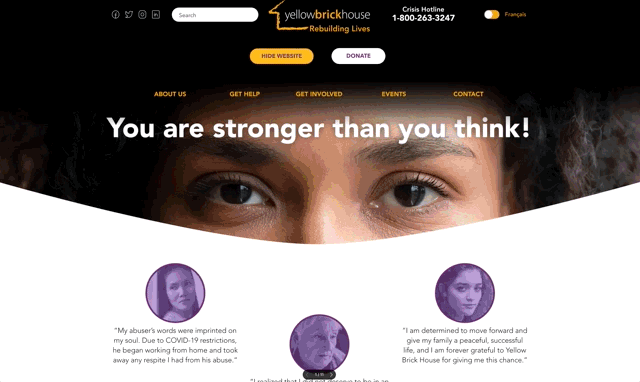
(Please note that their website was redesigned shortly before this case study was concluded)
YBH website - AFTER redesign